
This was about as compressed as the message from David Newton's Talk on Universal Web Design at Open Source Bridge 2015 as you could get. Most helpfully, it's also one of the ways to make sure that your regular users and your edge case users both stay happy with your work and continue to use your program.
Mobile users of websites, app users verus desktop users, and so forth can create headaches if the functions of each of your various methods are different than each other. Edge case users may gravitate to one version and stick with it because it contains the functions they are looking for, and then get mightily upset with you, or jump ship to another program that can implement the same protocol should that function disappear from your program or from the service. Having a single design from the start definitely seems like a more sensible idea. Let's take a look at an example.
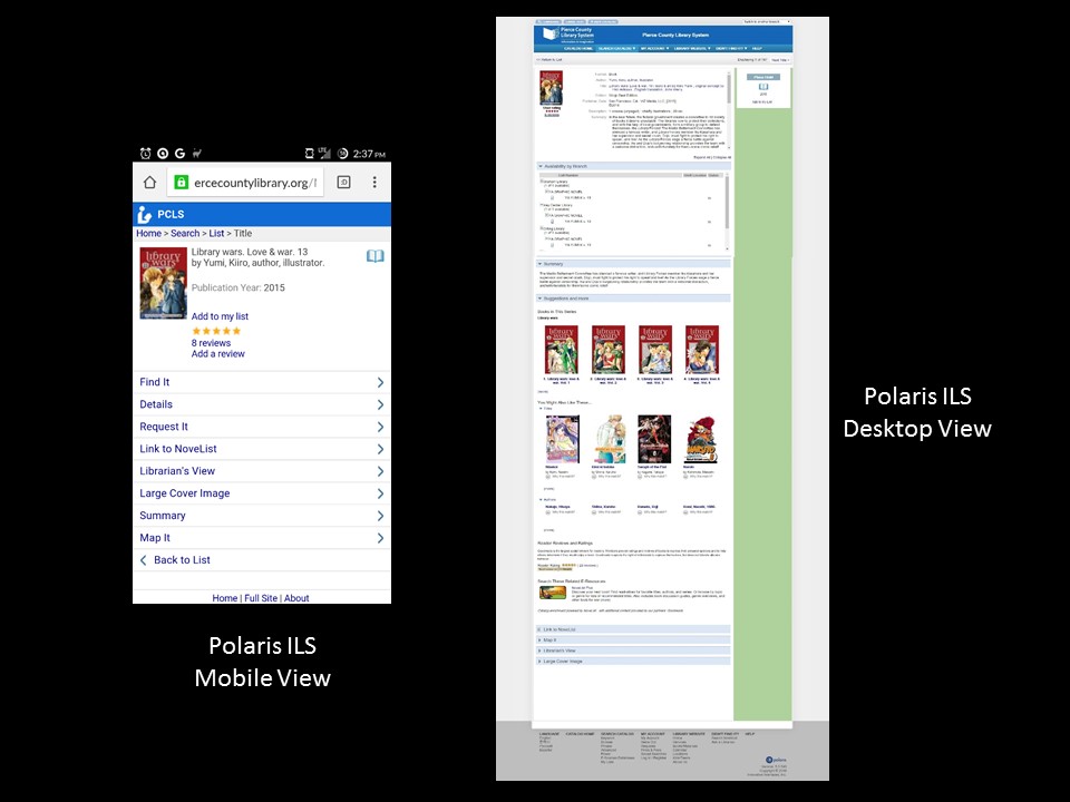
Polaris, the Integrated Library System that my public library uses, offers two different forms of our Online Public Access Catalog (OPAC) depending on whether or not the web browser requesting the page identifies itself as a mobile browser or as a desktop client. You can see that the desktop-offered page is full of already-opened segments, with information and recommendations and lots of other fun things glance over, as well as where one might find this particular book. The mobile version of that page is much starker, with a lot less visible information, instead requiring someone to tap on the information they want to see enxt. This makes it less hefty on the bandwidth draw for the initial page, but it then requires more requests to get all the information that is displayed in one shot on the regular page. There's probably a happy medium that could be arranged for both of these designs to merge into one - maybe availability is displayed on both designs by default and some of the other, lesser-used options go hide?
It would be nice to dig into the internals of the displays of each of these elements and tailor them so that we can present a unified experience for someone, regardless of whether or not they are coming by mobile device or on a desktop to the OPAC. But that requires either people on your end that can do it or having a good enough in with the people who the programming for your ILS to have them do it for you. If you don't have either of those options, then frustration seems to be your only recourse.