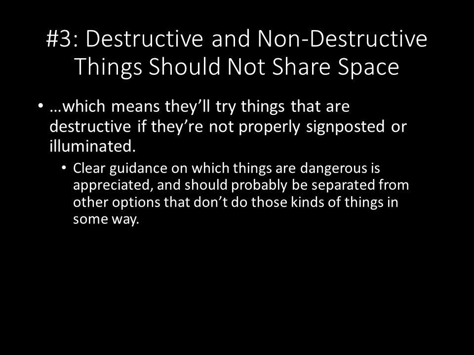
Okay, so this particular example doesn't apply just to edge cases, but there are a lot of programs where I see on the (advanced) options screens things that allow users to choose destructive options along with non-destructive ones. They can be signposted particularly well, or given a "Do Not Touch" box to help someone to avoid clicking on them accidentally, but it seems like a good design decision to shunt destructive options to their own specific menu so as to avoid the temptation to see what the button does, and whether pushing it will fix whatever problem has driven someone this far into the options menus.
You'll want to do this because...