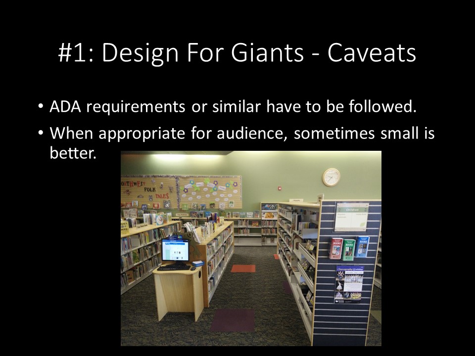
The caveat to designing for giants is that you still have to design for your audience. My library system offers a good reason why someone would not want to design for giants in the use of varied-height shelving for different collections of materials. The picture book and beginning reader shelves are at the height of the left shelf in this picture, which makes them great for the young children that are the primary audience of picture books and beginning readers. Picture books and beginning readers are on the smallest shelves, elementary and middle-grade books are on an intermediate-height shelf, and teen and adult books are on the tallest shelves. By using height differences, the collection's intended audiences are marked more clearly and it provides a handy visual reference, much like those height charts at the roller coaster rides, of the level of the books.
While the bigs that accompany these littles may find the child-sized design problematic, because they're bigs (and possibly bigs with mobility issues and difficulties in getting to the appropraite child-sized level), the need to provide an appropriately-sized space for the primary audience (rightly) overrules the comfort of those who are outside the audience. That said, there are couches and furniture that the bigs can use to sit and get down to child level for interaction, at least.
Accessibility concerns also go here as caveats. Designing for giants is great, but, especially in places that have to deal with the Americans With Disabilities Act or other guidance that has certain requirements, those requirements have to be met in the design.